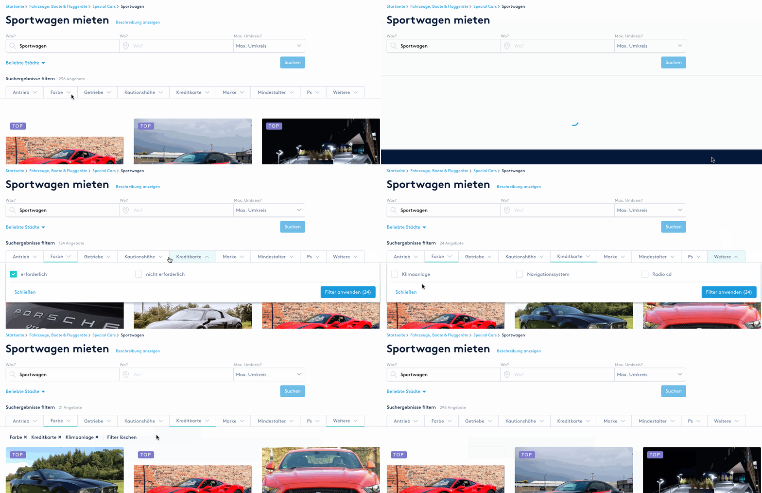
Search and filters for Erento
Product
Erento is Europe's largest two-sided marketplace platform, connecting rental companies with their potential customers. Out of hundreds of product categories offered, the most popular are caravans/camper vans, equipment for parties and sports cars. As part of the Product and Development team, I worked at Erento as a UX/UI Designer with sole responsibility for a number of projects, including this one.
Background
Category pages were considered the most important parts of the Erento site, as they would bring majority of traffic from Google (±73%). Out of these, an average of 73% of sessions were generated by the new users, usually completely unfamiliar with the platform. Therefore, optimising usability of the Category pages had always been one of the top Product priorities.
Problems: Filters
During the initial redesign of Category pages in 2016 implemented by the previous team, the layout was changed completely. Filtering sidebar became a filters box and was placed above the list of products. Size of the box turned out to be problematic: it would push the results down and away from view, so that on the popular screen sizes (eg. 13in MacBooks) top row of products would not be even visible. For some Users, this was confusing.
Problems: Search
The What/Where search bar was placed next to the logo as part of the top navigation, which was a logical and overall common design pattern. However, results of multiple User Testing sessions painted a different picture: when asked to narrow the results down using a specific location, Erento Users displayed behaviour similar to banner blindness, completely ignoring the top navbar. Their focus was instead on the heading with a category name, where they would use SEO links to complete the task. These SEO links only displayed a selection of cities, so some Users were simply assuming that products were only available in the locations listed there.
To do
Rethink the header component to improve User Experience when searching and/or using filters.
Step 1: Research
For filters, I went through multiple in-depth research articles from Baymard Institute (https://baymard.com/) to get informed on best practices and things to watch out for from the usability perspective. For UI inspiration, I visited multiple other e-commerce sites which provided their users with a large number of filtering options and did it well (eg. Zalando, Asos).
The last important factor was identifying different types of filters, length of their labels (especially in German) and the overall number for which the design would have to cater. This differed from a category to category, so I took the worst case scenario (8-9 filter types in a category) as the benchmark.
As for search, guided by the heatmaps of Category pages generated by Hotjar, as well as observations from User Testing, I looked for inspiration on sites like Skyscanner. Their search would usually be placed within the hero component, leaving the top bar for logos and navigation. The task was to see how this could work for Erento.
Step 2: Suggest a solution
Taking all the research and requirements into consideration, applying brand style guide and elements from the design system, I proposed the following solution tackling both filters and search simultaneously.
The design ended up being very simple but functional. Changes could be applied easily to refine the results. Depending on the category, the filters presented would differ. The search bar could also be customised to include date selection on some of the categories.

Step 3: Verify
Before the release: Updated design (hosted on the testing environment) was first tested with a handful of Users who were asked to complete several tasks related to filtering results and using the location search. The reception was very positive and no usability issues were identified.
After the release: Use of location search improved significantly. Heatmaps show the improvement from 5.36% before the redesign to 26.67% afterwards (clicks-based). As for filters, we discovered that Users who’d apply them were more likely to book: enquiry-booking rate for use cases with no filters was roughly 4.42%, compared to 7.55% for use cases with filters applied.
Step 4: Reflect and improve
Overall, the redesign was a success, but as time goes on, new changes will be necessary.
From strictly visual point of view, as the design and style of the UI develops, search and filters will need to be aligned as well.
There’s also a possibility of introducing filtering “presets”, which could be especially handy for Users without expert knowledge (eg. someone going on a camping holiday for the first time, not knowing what vehicle would be best for them). By selecting one of the presets, eg. “family holiday”, “camping with friends”, a number of filters would be automatically applied to show the best results identified by the search algorithm.
Another idea, albeit a riskier one, would be replacing complex category pages with more emotional landing pages and implementing a flow similar to Thumbtack’s. In that case, Users would fill in a multi-step questionnaire and receive best matching results via email afterwards. There are a lot of business implications to consider when moving to a completely different model of interaction such as the one described above. The platform has not yet made any drastic changes and continues to operate as it did before.